ODI Match Prediction with Elo Scores and Sklearn

Introduction

The Elo scoring system was created by Arpad Elo, a Hungarian-American physics professor, and was originally used as a method for calculating the relative skill of players in zero-sum games, such as chess. The ranking system has since been used in a variety of sporting contexts, and since the Moneyball revolution has become ever more popular, primarily due to the fact that Elo rankings have been shown to have predictive capabilities.

A team’s Elo score is represented by a number which either increases or decreases depending on the outcome of games between other ranked teams. After every game, the winning team takes points from the losing one. The difference between the ratings of the winner and loser determines the total number of points gained or lost after a game; the number of points both lost and obtained are weighted according to the quality of the team, which accounts for unexpected results (aka sporting upsets). Although the initial number allocated to a team is somewhat arbitrary, most previous analyses have used 1,500 as the starting figure.

I’ve previously tried my hand at using Elo scores to predict match outcomes using Indian Premier League (IPL) match data and binary logistic regression. Though this continues to have good utility, the manner in which players are drafted and teams change from season to season in the IPL means that Elo scores are especially sensitive when used in this context. Also, the IPL has only been running since 2008, so data is limited, which can lead to relatively spurious findings. The model could predict wins based on massive differences in Elo scores between teams, but not when opponents were more evenly matched.

Therefore, I wanted to perform a similar sort of analysis on One Day International (ODI) Elo scores, as there is considerably more data for this format of the game (1972–2019). Furthermore, I wished to assess a variety of machine learning techniques, including hyper-parameter optimisation and cross-validation to determine the best model to estimate ODI match outcomes with Elo as the primary predictor. Using all ODI match data from Kaggle, I was able to create a few more feature variables to enrich models and subsequently improve accuracy. The iterative approach will be discussed below.

Methods

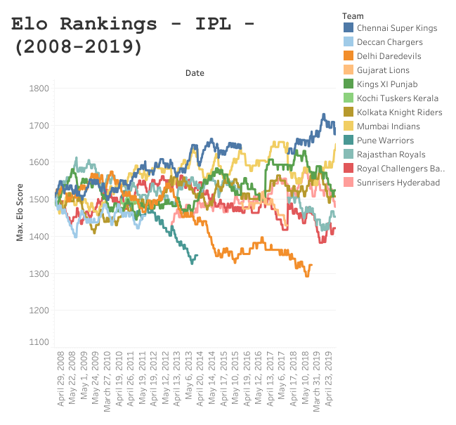
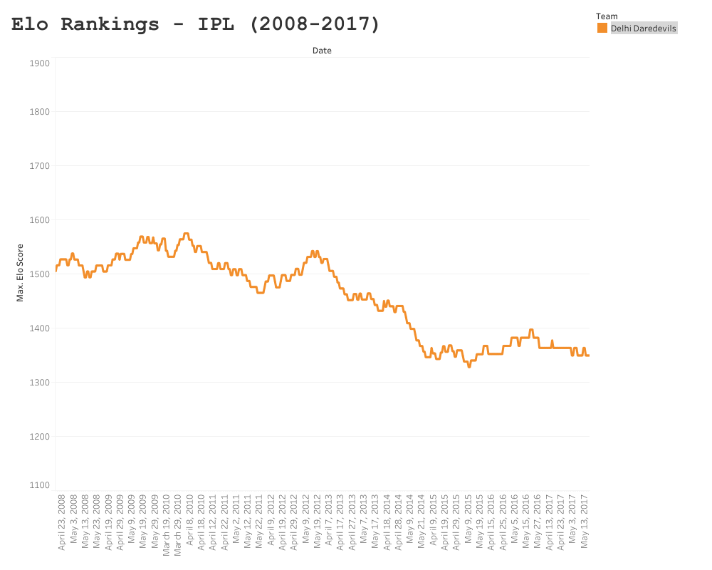
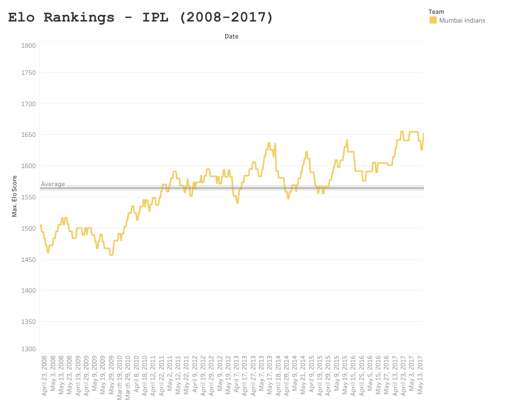
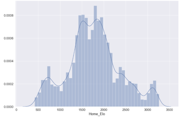
Prior to performing any of the nitty-gritty analysis or machine learning, you are going to be faced with the daunting task that will be all too familiar to any sports statistician: spreadsheet maintenance. I have used the EPSNcricinfo API before to loop through data, but (as previously mentioned) all ODI match data is available in Kaggle and comes in a format that is suitable for computing Elo scores. You can find my workings on Googly Analytics, which breaks down the formulae and methods used to calculate Elo rankings for international cricket. Once you have a suitable system in place, you can plot the Elo scores over time, which will give you a feel for how win and loss streaks affect overall performance of teams (Figure 1).

First, open Jupyter Notebook or your IDE of choice and install the necessary packages:

import pandas as pd
import seaborn as sb
import matplotlib.pyplot as plt
import plotly.graph_objects as go
import plotly.express as px
import chart_studio
import chart_studio.plotly as py
from sklearn.model_selection import train_test_split
from sklearn.linear_model import LogisticRegression
from sklearn.model_selection import GridSearchCV
from sklearn import metrics
import numpy as np
from sklearn.impute import SimpleImputer
from pylab import rcParams
from sklearn.neural_network import MLPRegressor, MLPClassifier
from sklearn.metrics import accuracy_score
from sklearn.ensemble import RandomForestClassifier, RandomForestRegressor
import joblib
import pandas as pd
from sklearn.metrics import accuracy_score, precision_score, recall_score
from time import time

Read in your Excel file, store it as a Pandas object and visualise the format of the data:

local = ‘/.../.../.../Elo_pred.xlsx’
elo = pd.read_excel(local)
elo.head(100)

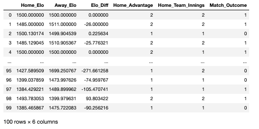
As seen in the data-frame above, there are a number of variables that I created prior to importing the Excel file. Each row in this data-frame represents a head-to-head fixture that happened any time between 1972 and 2019:

Home_Elo: the Elo score of the home team on the date of the fixture

Away_Elo: the Elo score of the away team on the date of the fixture

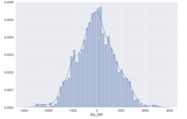
Elo_Diff: the difference in Elo between the home and away team

Home_Advantage: whether the game was won by the home team or not (2 = yes, 1 = no)

Home_Team_Innings: whether the home team batted or bowled first (2 = batted, 1 = bowled)

Match_Outcome: the variable we are looking to predict, represents the outcome of the fixture (1 = home team won, 0 = home team lost)

You may want to visualise the distributions of some of your predictor variables:

elo_dist = sb.distplot(elo['Home_Elo'])
elo_dist = sb.distplot(elo['Elo_Diff'])

You’re now going to want to split your data into train, test and validation data. The training data will be used to train individual models, where the test data will be used to assess the accuracy of the models we have trained. We will then use a validation dataset at the end to assess model performance in comparison to all other models utilised. There is no option within Sklearn to split the data into three constituents; the following syntax will split the data into a standard train–test split of 60:40 and further divide the train dataset into train and validation constituents (20:20):

## Split features (x) and outcomes (y)
features = df[['Elo_Diff','Home_Elo', 'Away_Elo', 'Home_Advantage','Home_Team_Innings']].copy()
labels = df['Match Outcome']
## Train - test
X_train, X_test, y_train, y_test = train_test_split(features, labels, test_size=0.4, random_state=42)
## Validation
X_val, X_test, y_val, y_test = train_test_split(X_test, y_test, test_size=0.5, random_state=42)

To ensure your data has split correctly:

for dataset in [y_train, y_val, y_test]:
print(round(len(dataset) / len(labels), 2))
> 0.6
> 0.2
> 0.2

Logistic regression

The first model we are going to train is a logistic regression. As we have a binary outcome measure, this is typically a good starting point; models are easier to train and logistic regression is suitable for binary problems. Prior to fitting the logistic model, it is important to ensure we are using the optimal hyper-parameters that we will pass into the Sklearn modules. The parameter that we are going to optimise is C, which controls the degree of regularisation the model will use. A low C value is equal to a degree of high regularisation and subsequently lower complexity, and a high C value is equal to lower regularisation and a higher degree of complexity. As this value essentially represents how closely the logistic model fits to the training data, a higher C value can lead to over-fitting. 

The following function prints out the optimal input value for the parameter you pass through:

def print_results(results):
print('BEST PARAMS: {}\n'.format(results.best_params_))
means = results.cv_results_['mean_test_score']
stds = results.cv_results_['std_test_score']
for mean, std, params in zip(means, stds, results.cv_results_['params']):
print('{} (+/-{}) for {}'.format(round(mean, 3), round(std * 2, 3), params))

You can then store the input values you want to assess:

lr = LogisticRegression()
parameters = {
'C': [0.0001, 0.001, 0.01, 0.1, 1, 10, 100, 1000]
}

And use GridSearchCV() on your training data to view the cross-validation of your input parameters:

log_cv = GridSearchCV(lr, parameters, cv=5)
log_cv.fit(X_train, y_train.values.ravel())
print_results(log_cv)

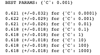
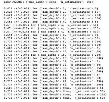
You can see that the recommended best input value for C is 0.001, indicating that we can achieve ~62% accuracy with a fairly high level of regularisation; which un-intuitively means a less “complex” fitting of the data.

We should store this best estimator for when we validate the logistic model against other models used:

joblib.dump(log_cv.best_estimator_, '/.../.../.../EloScores/LOG_model.pkl')

We can now fit our logistic model using the recommended hyper-parameters:

logreg = LogisticRegression(C = 0.001)
model = logreg.fit(X_train,y_train)
log_y_pred=logreg.predict(X_test)

You can print the accuracy of the model:

print("Accuracy:",metrics.accuracy_score(y_test, log_y_pred))
>> Accuracy: 0.6254467476769121

And print a confusion matrix for the model predictions:

%matplotlib inline
rcParams['figure.figsize'] = 10, 7
class_names=[0,1] # name  of classes
fig, ax = plt.subplots()
tick_marks = np.arange(len(class_names))
plt.xticks(tick_marks, class_names)
plt.yticks(tick_marks, class_nxmes)
# Create heatmap
sb.heatmap(pd.DataFrame(cnf_matrix), annot=True, cmap="YlGnBu" ,fmt='g')
ax.xaxis.set_label_position("top")
plt.tight_layout()
plt.title('Confusion matrix', y=1.1)
plt.ylabel('Actual label')
plt.xlabel('Predicted label')
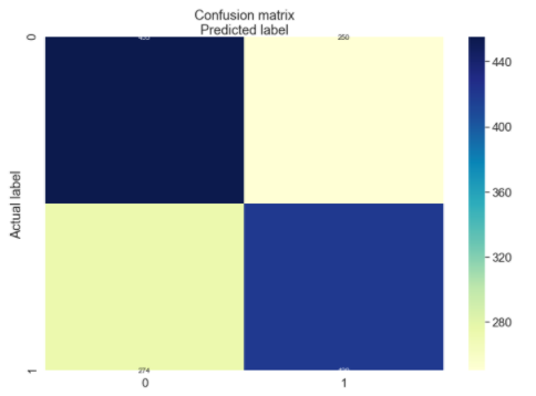
array([[455, 250],
 [274, 420]])

Random forest model 

As seen above, we achieved ~62% accuracy with a basic binary logistic regression, which is a good starting point but leaves a lot to be desired. The next model we will train is a random forest model.

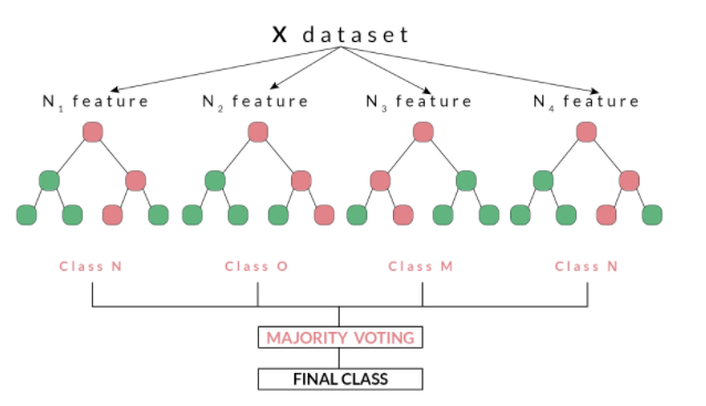
Random forests, as suggested by its name, consists of a large number of individual decision trees that operate as an ensemble. Each independent decision tree provides a classification outcome, and the class with the highest proportion of outcomes is elected as the prediction for that individual classification (Figure 2). The random forest model works on the premise that “A large number of relatively uncorrelated models (trees) operating as a committee will outperform any of the individual constituent models.” Tony Yiu explains that “The low correlation between models is the key. Just like how investments with low correlations (like stocks and bonds) come together to form a portfolio that is greater than the sum of its parts, uncorrelated models can produce ensemble predictions that are more accurate than any of the individual predictions. The reason for this wonderful effect is that the trees protect each other from their individual errors.”

For this reason, random forest models have good utility for classification problems and will be used on our match outcome data, which is in binary format.

Figure 2. An example of a random forest model, using a number of decision trees and a majority voting to make a final classification

Before fitting our random forest model, we will tune some hyper-parameters as we did for our logistic model. The print_results() function used before will print the optimal hyper-parameters for our random forest using the same training data. The parameters we are going to optimise are n_estimators,which is the number of decision trees in the forest, and the max_depth, which is the depth of the tree. The default for max_depth is “None”, which means the nodes are expanded until all leaves are pure or until all leaves contain less than min_samples_split samples:

rf = RandomForestClassifier()
parameters = {
'n_estimators': [5, 50, 250,500],
'max_depth': [2, 4, 8, 16, 32, 64, None]
}
rf_cv = GridSearchCV(rf, parameters, cv=6)
rf_cv.fit(X_train, y_train.values.ravel())
print_results(rf_cv)

Again, we should store this best estimator for when we validate the random forest model against other models used:

joblib.dump(rf_cv.best_estimator_, '/.../.../.../EloScores/RF_model.pkl')

We can now fit our random forest model using the aforementioned parameters (as the recommended max_depth was “None”, this is set to default):

rf_model = RandomForestClassifier(n_estimators=500)
rf_model.fit(X_train, y_train)
rf_predicted_values = rf_model.predict(X_test)

We can now print the accuracy of the model:

print("Accuracy:",metrics.accuracy_score(y_test, log_y_pred))
>>> 0.7055039313795568

Multilayer perceptron

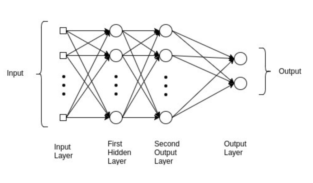
As you can see, we have improved the accuracy from our baseline logistic regression to ~71%. The final model we are going to fit is a multilayer perceptron (MLP), which is a class of feed-forward neural networks, meant to emulate the neurophysiological process by which the brain processes and stores information. MLPs are often utilised in supervised learning problems, where they train on a set of input–output pairs and learn to model the correlation between them. Training typically involves adjusting the parameters, or the weights and biases of the model, in order to reduce error between the desired and computed outcome. This method is commonly referred to as back-propagation, where randomly assigned weights and biases are recalibrated to reduce error after each forward–backward pass of an input parameter. 

The multilayer perceptron consists of an input layer and an output layer and any number of hidden layers (which will be tuned according to the data you have available). At both your output layer and all of your hidden layers, an activation function is performed which passes the data on to either a subsequent hidden layer or to the final outcome of the individual classification (this is what “feed forward” pertains to; Figure 3). MLP is suitable for both classification and regression problems, but does not perform optimally on smaller datasets. The above description is heavily paraphrased and I recommend reading Nitin Kumar Kain, who explains MLP in more granularity.

Figure 3. An example of an MLP model with a binary outcome, such as used with the Elo predictions in this article

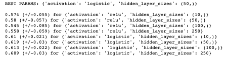
Before fitting our MLP model, we will tune some hyper-parameters, as we did for our logistic and random forest model. The print_results() function used before will print the optimal hyper-parameters for our MLP using the same training data.

The parameters we are going to optimise are hidden_layer_sizes, which is the number of nodes in the ith hidden layer and activation,which is the activation function for the hidden layer. For the activation function, we are going to determine which function is preferable between a logistic and relu activation:

Logistic: uses a sigmoid function (such as logistic regression), returns f(x) = 1 / (1 + exp(-x))

Relu: the rectified linear unit function, returns f(x) = max(0, x). If the value value is positive, this function outputs the input value, otherwise it passes a zero

mlp = MLPClassifier()
parameters = {
'hidden_layer_sizes': [(10,), (50,), (100,),(250)],
'activation': ['relu', 'logistic'],
}
mlp_cv = GridSearchCV(mlp, parameters, cv=5)
mlp_cv.fit(X_train, y_train.values.ravel())
print_results(mlp_cv)

Again, we should store this best estimator for when we validate the MLP model against other models used:

joblib.dump(rf_cv.best_estimator_, '/.../.../.../EloScores/MLP_model.pkl')

We can now fit our MLP model using the aforementioned parameters:

mlp_model = MLPClassifier(hidden_layer_sizes=(50,), activation='logistic')
mlp_model.fit(X_train, y_train)
mlp_predicted_values = mlp_model.predict(X_test)

We can now print the accuracy of the model:

print("Accuracy:",metrics.accuracy_score(y_test, log_y_pred))
>>> 0.6275911365260901

As with all of these models, there are any number of hyper-parameters you can fine-tune in order to best fit your data. With MLP, this can always come at the cost of over-fitting your data. Other hyper-parameters that are pertinent to successful tuning of an MLP include the number of epochs, batch size and methods of back-propagation, which are beyond the scope of this article but should be considered when training an MLP model.

Model validation and summary

As seen above, we split our data such that we had a validation set which would be used to compare models in the final stage of this assessment. This data is completely alien to any of the models used at the validation stage, so can be used as a strong gauge of the performance of the models we have trained. Furthermore, we have also been storing the best estimators using a variety of hyper-parameters for this purpose. 

The following code will loop through your stored best estimators:
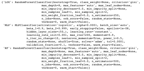
models = {}
for mdl in ['LOG','MLP', 'RF']:
models[mdl] = joblib.load('/Users/hopkif05/Desktop/EloScores/{}_model.pkl'.format(mdl))
models

The three measures we are going to use to determine the performance of our models are:

Accuracy: the overall correct classifications (# predicted correctly / total # examples)

Precision: # correctly predicted 1s / total # predicted 1s

Recall: # correctly predicted 1s / total # of actual 1s

The following code will create a function to evaluate and compare the models used. As seen, the model.predict() function exists between both start and end-time functions, which means we can compute a latency value for each model, to assess how long they take to compute predictions:

def evaluate_model(name, model, features, labels):
start = time()
pred = model.predict(features)
end = time()
accuracy = round(accuracy_score(labels, pred), 3)
precision = round(precision_score(labels, pred), 3)
recall = round(recall_score(labels, pred), 3)
print('{} -- Accuracy: {} / Precision: {} / Recall: {} / Latency: {}ms'.format(name,
accuracy,
precision,
recall,
round((end - start)*1000, 1)))

We can now loop through our models into this function:

for name, mdl in models.items():
evaluate_model(name, mdl, X_val, y_val)
>>> LOG -- Accuracy: 0.693 / Precision: 0.686 / Recall: 0.779 / Latency: 44.1ms
>>> MLP -- Accuracy: 0.619 / Precision: 0.656 / Recall: 0.593 / Latency: 1.8ms
>>> RF -- Accuracy: 0.71 / Precision: 0.73 / Recall: 0.718 / Latency: 113.6ms

As seen from the above, our random forest model performs the best on unseen data, with the best accuracy and precision score; it does, however, take the longest to make predictions. This is OK for this relatively small dataset, but could be problematic if this were to increase in size. The other trade-off to consider regards precision vs. recall, as the two are typically inversely related. The logistic model scores higher for recall and latency, but, given the small dataset previously mentioned, we would allow for this in order to capitalise on the extra accuracy and precision. As with all validation, this comes down to the problem you are trying to solve and the suitability of the model. As can be seen, the MLP model performs the worst for all performance indicators, which could be down to a couple of factors. First, MLP performs inadequately on smaller datasets and may not be appropriate for the Elo score data used. Second, hyper-parameter optimisation for the MLP was fairly concise in the current assessment, given how many parameters can be tuned to optimise an MLP model. Future MLP modelling could consider optimising the number of epochs and/or batch size or methods for back-propagation.

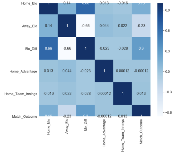
Finally, the quality of input variables should be considered. As seen in the correlation map below, the only remotely correlated variables to our match outcome measure (Match_Outcome) are related to Elo score (Home_Elo, Away_Elo and Elo_Diff). Given that additional metrics were used in order to enrich the Elo associated data, it could be that the additional feature variables (Home_Advantage and Home_Team_Innings) were not able to improve performance of the models used, and other variables should be considered. 

plt.figure(figsize=(12,10))
cor = df.corr()
sb.heatmap(cor, annot=True, cmap=plt.cm.Blues)
plt.show

It can, however, be determined that our random forest model was able to achieve relatively high levels of accuracy (71%), precision (73%) and recall (71%) using Elo associated data, which in part validates the Elo ranking system in this given context. It would be worth experimenting with the K Value used in the Elo calculations; this coefficient mediates how reactive the Elo scores are in response to a win or loss, and should be altered according to the sporting context. I used a value of 22, which aligns with what I used for my IPL model, but this may have been too conservative in ODI cricket, which has been running for a longer period of time, and thus could be considered a more “predictable” format of the game.

Peak strike rate scripts (v1)

I previously posted an R script which plots the distribution of age at peak batting average (runs/innings) of the English team, to answer the all important question in sports performance of “when do athletes peak?”.

But due to how the game has many formats, it seems unfair to judge performance merely on when the batters’ average peaks. For instance, strike rate is a measure that predicts peak performance in the T20 and ODI format. So, I thought it only fair to write some code that used the same logic as before, but to plot the distribution of age at peak strike rate. The same inclusion criteria was used as in the previous script, and the IDs of players were pulled from the ESPN Cricinfo API to call these players into the dataset. I have changed a couple of things for the strike rate script. Firstly, my example presented in this post uses all ODI data, not just England (for any player that has played >= 20 ODIs). This code however can be used to look at data from all formats by amending the script, where fetch_player_data pulls the ID and selected format:

for(i in playerid) {
playerInfo <- cricketdata::fetch_player_data(i, “odi”)
playerInfo$id <- i
battingData <- rbind(battingData, playerInfo)
}

Secondly, the package I was using before to plot the data was identifying the mean age (for peak performance as measured by batting average), where if we were identifying where most players peaked, we would want a mode value. Therefore the latest script includes two plotting options.

The count for each age, and the mode:

And the distribution with density:

You can grab the code here on my Github.

As usual, I’m always eager to get the opinion of my fellow analysts on how these can be developed, so don’t hesitate to get in contact with me.

When do English batsman peak?

So, I previously shared some of my code and working calculations for peak batting performance and mentioned I would be following up with some subsequent analysis off the back of this work. I would have had this out sooner, but a.) I have a day job, and b.) each call to the ESPN Cricinfo API is taking a very, very long time. But I thought given both my nationality, and with us playing well in the ICC World Cup at the moment, I would share a comparison between England Test match and ODI data; and some words of advice at how to interpret these stats.

The first plot is for the distributions of age at peak performance, for all England Test match data I could call from the API. Peak performance is a metric I defined myself, and could be actually be recognised as age at peak batting average. I made this after ten individual innings per player, because there will naturally be anomalies when batters get off to absolute dynamite starts, averaging 60+ for their first ten matches; so this metric can be tweaked if anyone has a better method of defining peak batting performance.

The mean age at peak performance is 29.36, but this may or may not be the best value to go off when trying to ascertain peaks. The mean will be all of the ages within the data pool divided by the total count of data, where we want to know when most players peak, so it may be best to go off the most occurring age, which in the case of the data presented is 29. So it can be identified that the age at which most English batters peak (i.e the mode), is at 29.

Peak Batting Performance Age – All England Test Match Data; using the ggstatsplot package in R

When using these values, this is considerably higher than ODI cricket, where it can be seen that the age at which most English batters peak is at 25. Given the varying nature between each format of cricket, the age difference is not a surprise, although I would expect the ODI peak would be somewhat later; it may be that the inclusion criteria needs to be > 10 innings, so this can be tweaked as and when. However, it can be concluded that English batters peak later in test match cricket than in ODI; which makes sense given that test match cricket requires greater psychological aptitudes compared to ODI (which is deemed to be more of an “athletic” format).

Peak Batting Performance Age – All England ODI Data; using the ggstatsplot package in R

As expected both plots follow a fairly normal distribution; you would not typically expect a player’s peak batting average to be when they are either 17 or 40 years old. Furthermore, it appears that there have been far less teenage test match innings than that of the ODI format for English cricketers, which follows the typical progression that has been exemplified by the English Cricket Board throughout the years. The next progression for this series of analyses will be to pool all countries together to see if this variance between ODI and test match “peak age” is specific to England, or if it a finding that is representative of the general trends for each format. Hold tight.

Script-dev For Peak Performance

So, I’ve been developing a script to determine the average age of peak performance in cricket, using the ESPN Cricinfo API and with the help from a trusted colleague at the Beeb. I’ve provided an example above, which displays the distribution of age at peak performance for all English batsman in ODI cricket, that I could call from the API. The purpose of this work is to determine an average of when most athletes peak in cricket; which in turn has practical implications for recruitment and team management. In this case, peak performance is defined as the age when the batsman’s batting average (runs/innings) occurred. I have made the the code open source, as I am keen to see what people make of the logic, so please feel free to view what I have developed on Github, as I am always eager to update how this is simulated. The visuals are from ggstatsplot(), which is a beautiful statistical analysis package, which does the hard work in ggplot2 for you.

In weeks to come I’m going to post some findings from this analysis, and how peak performance for batting (and bowling) varies from nation to nation, as well as the potential to include other demographic segments. Hold tight.

Peak Batting Performance – Age Distribution – England ODI Data

IPL – Current Elo Rankings – Probabilities

Below you will find a hypothetical list of fixtures, the difference in current Elo rankings between the two teams and the probability of the home team winning based on these rankings. It is important for me to reinforce all of the above with some caveats, before I discuss how I modelled this data. On the point of this being current Elo rankings, that means as of the end of the 2019 campaign, so in theory all of these fixtures would have to be on the very first day of the season, as their Elo rankings will deviate based on how they actually begin the campaign (when the season is actually underway, I will build out a dynamic version of below, which will aggregate actual win-losses). The same goes for the probabilities; as these were computed by mapping the difference in Elo rankings between teams, the probabilities I modelled out will also shift as teams win and/or lose throughout next season. Finally, all of the hypothetical fixtures presented are from the teams that competed in the most recent IPL campaign, whilst the data used for the model is from all IPL fixtures, regardless of the team (given how the IPL has been so far, I wouldn’t be surprised if new teams appear or some current teams fold). The data used for the probabilities below, was modelled using the Elo scores I computed.

The Model

The build process for the model I used was fairly simple. All it entailed was mapping the outcome of every match since 2008 against the difference in Elo between each team. There was data that needed to be manually excluded; for instance, the first eight fixtures of the 2008 campaign – as there was often no difference in Elo points, as teams were still on the predetermined (and somewhat arbitrary) 1500 points. The same goes for teams that joined the league at later stages; the Kochi Tuskers Kerala for instance, had a cameo appearance in 2011 and although some of their data was included in the model, this was once they had gained “some” traction (i.e. their Elo score had deviated from baseline).

A binary logistic regression, was used for modelling the data with the lgm() function in R. All this entails is assigning a [1] to a victory and a [2] to a loss, and the difference in Elo points between the two teams prior to their encounter. This wasn’t too labour-intensive, as in order to calculate Elo points, you have to assign victories and losses in a binary fashion anyhow; this makes running the regression straight forward; which should look as such: y (binary outcome of the match) ~ x (difference in Elo ranking prior to match)

Findings

The probabilities from below present a few questions. Firstly, it seems that there really are no “dead certs”, when using Elo as your sole predictor of match outcome. What this suggests is three-fold. Firstly, it may be the K Value assigned in my initial Elo calculations was too conservative, perhaps IPL win-streaks are a better indicator in determining the season and potentially Elo needs to reflect this by having a more responsive mediator (this will in turn make the difference between better and worse teams greater, thus increasing winning probabilities). Secondly, the % of Elo carried over in consecutive seasons may also be too conservative, it may be that its an unfair penalty to those teams that finished a season strongly to take away some of their hard work; it could be that this is under-representing the true difference in Elo between the better and worse teams. Finally, compared to other Elo models, the IPL dataset is quite small. This is because the league has only been around for 11 years. Although there are still ~900 data points in the model, what this means is that the data of the earlier years of the IPL could be under-representing true differences between teams. In essence, in the earlier years of IPL competition, performance was more varied, as teams were finding their feet in the league; as Elo ratings from these years is (in some part) carried over from year to year, this will in turn effect Elo differences and win probabilities. Later work will look at segmenting year-by-year performance, because the first few years of the IPL could be skewing the model.

Home TeamAway TeamDifference in Elo PointsWin Probability
Chennai Super KingsDelhi Capitals227.473.0%
Mumbai IndiansDelhi Capitals20267.6%
Mumbai IndiansRajasthan Royals19662.4%
Mumbai IndiansKolkata Knight Riders14262.3%
Chennai Super KingsRoyal Challengers Bangalore252.760.8%
Chennai Super KingsKings XI Punjab150.560.0%
Chennai Super KingsRajasthan Royals221.560.0%
Chennai Super KingsSunrisers Hyderabad196.258.4%
Mumbai IndiansRoyal Challengers Bangalore22758.3%
Mumbai IndiansSunrisers Hyderabad17157.9%
Chennai Super KingsKolkata Knight Riders167.257.1%
Mumbai IndiansKings XI Punjab12555.3%
Kings XI PunjabRoyal Challengers Bangalore10254.3%
Kolkata Knight RidersRoyal Challengers Bangalore8553.5%
Kings XI PunjabDelhi Capitals7753.2%
Kings XI PunjabRajasthan Royals7152.9%
Kolkata Knight RidersDelhi Capitals6052.4%
Sunrisers HyderabadRoyal Challengers Bangalore5752.2%
Kolkata Knight RidersRajasthan Royals5452.2%
Kings XI PunjabSunrisers Hyderabad4651.8%
Chennai Super KingsMumbai Indians25.451.1%
Delhi CapitalsSunrisers Hyderabad-31.251.1%
Rajasthan RoyalsRoyal Challengers Bangalore3151.1%
Sunrisers HyderabadDelhi Capitals3151.1%
Kolkata Knight RidersSunrisers Hyderabad2951.0%
Delhi CapitalsRoyal Challengers Bangalore25.350.9%
Kings XI PunjabKolkata Knight Riders1750.5%
Rajasthan RoyalsDelhi Capitals650.0%
Sunrisers HyderabadRajasthan Royals2550.0%
Delhi CapitalsRajasthan Royals-5.949.5%
Kolkata Knight RidersKings XI Punjab-1749.0%
Royal Challengers BangaloreDelhi Capitals-2548.6%
Rajasthan RoyalsSunrisers Hyderabad-2548.6%
Mumbai IndiansChennai Super Kings-2548.6%
Sunrisers HyderabadKolkata Knight Riders-2948.5%
Royal Challengers BangaloreRajasthan Royals-3148.4%
Sunrisers HyderabadKings XI Punjab-4647.7%
Rajasthan RoyalsKolkata Knight Riders-5447.3%
Royal Challengers BangaloreSunrisers Hyderabad-5747.3%
Delhi CapitalsKolkata Knight Riders-60.147.1%
Rajasthan RoyalsKings XI Punjab-7146.6%
Delhi CapitalsKings XI Punjab-76.946.3%
Royal Challengers BangaloreKolkata Knight Riders-8545.7%
Royal Challengers BangaloreKings XI Punjab-10245.2%
Kings XI PunjabMumbai Indians-12544.2%
Kolkata Knight RidersMumbai Indians-14243.5%
Kings XI PunjabChennai Super Kings-15143.1%
Rajasthan RoyalsMumbai Indians-19641.1%
Sunrisers HyderabadChennai Super Kings-19641.1%
Delhi CapitalsMumbai Indians-201.940.9%
Rajasthan RoyalsChennai Super Kings-22140.0%
Royal Challengers BangaloreMumbai Indians-22739.8%
Delhi CapitalsChennai Super Kings-227.438.9%
Sunrisers HyderabadMumbai Indians-17138.2%
Royal Challengers BangaloreChennai Super Kings-25337.5%
Kolkata Knight RidersChennai Super Kings-16735.3%

Indian Premier League – Elo Rankings (V2)

As promised, here is the complete dataset, and what I will start modelling on – with every IPL game since its inception in 2008. Below is a still shot as I’m still having issues embedding with WordPress, so please view the interactive entity I made.

Hold fire, in weeks to come I’m going to begin to make predictions on the 2020 IPL campaign based off of these scores and any anecdotal information I can get from my fellow sports analysts. As well as that I’m going to perform correlative analysis between Elo scores and other predictors and/or ranking systems in t20 cricket. I hope you enjoy the Tableau dashboard.

Indian Premier League – Elo Rankings (V1)

For some reason WordPress doesn’t want to embed the interactive Tableau visual I made for this report; so you can view the full version I created with this link.

What the El’ are you on about?

Now, the visual above looks somewhat noisy. In fact, if you have never stumbled across Elo rankings before, you will think this is pure noise; and to be completely honest that’s why I’ve included it in the head of this post. We can only typically begin to synthesise discernible information from data, when we begin to segment it, break it down and find out what is driving the data. In fact, to correctly interpret Elo data, it is pivotal that you understand what is driving the output, how the team is actually performing in real life and anecdotal data can be extremely important in understanding what’s going on. After all, the betting markets make an absolute fortune from just probabilities alone, it’s essential that you take a deeper look into data, and continue to update your assumptions. But first I will explain a little bit about Elo ratings….

The reason the image above looks so cluttered and trend-less, is because Elo ratings are (typically) a highly reactive points scoring system. The system was created by Arpad Elo, a Hungarian-American physics professor who originally computed it as a method for calculating the relative skill levels of players in zero-sum games such as chess. The ranking system has since been used in a variety of sporting contexts, and since the Moneyball revolution have become ever more popular, primarily due to the fact the fact that Elo rankings have been shown to have predictive capabilities.

A teams’ Elo rating is represented by a number which either increases or decreases depending on the outcome of games between other ranked teams. After every game, the winning team takes points from the losing one. The difference between the ratings of the winner and loser determines the total number of points gained or lost after a game; this is an imperative consideration as it accounts for big upsets in sports, which can have important knock-on effects throughout the teams’ season. Although the initial number allocated to a team is somewhat arbitrary, most previous analyses have used 1505 as the starting figure.

I won’t speak in great detail about the calculation or how this is computed/implemented, for this I will leave you in the trusted hands of the guys over at FiveThirtyEight. If you aren’t a fan of implementing calculations, feel free to contact me and I will send you a template.

IPL K Value

What I will discuss is a couple of things I tweaked in my model, which are specific not just to cricket (as that would be an all too vague refinement), but to t20 cricket and the Indian Premier League (IPL) in particular. I adjusted the K value to 22; which isn’t dissimilar to the value of ~20 used for FiveThirtyEight’s NBA model. This is intuitive as – similar to the NBA – winning and/or losing streaks are not just prominent, but highly indicative of how the team is actually playing in the IPL. The K value mediates the sensitivity to recent game changes to account for this. For sports like baseball, where there is a high degree of luck where game-by-game results are fairly noisy and your default assumption should be that a winning or losing streak is mostly good or bad fortune, streaks in IPL performance may reflect honest, if perhaps temporary, adaptations in team quality.

2017 IPL Win and Loss Streaks

Previous season weighting

Now, instead of refreshing Elo scores at the start of every season (which would make little sense), a weighting is typically applied at the beginning of the season depending on how the team finished in the previous season. In the context of the NBA, the team carries over 3/4’s of its Elo from the previous year, which I felt inappropriate for an IPL model. Now despite NBA rosters varying from year to year for each team – with a fairly busy transfer window – the IPL has a fairly unique format. Rosters in some cases are completely altered from the previous year, with players frequently swapping between teams, so it would be unfair to provide a team with a handicap that has not maintained at least most of the same personnel. For the V1 of my model, I used a 60% carry-over, but of course this is a process of refinement and if I see the need to adjust this percentage I will alter the threshold.

V1 of my model

In times to come, I will build out some predictions off the back of the model I’ve created, but as it stands I have only located data till the end of the 2017 IPL campaign; so will address this in V2. I will however, present some interesting findings. If you want to have a play around with the Tableau visual I made, feel free; and if you’re a fellow analyst, statistician or you’re just a cricket fanatic that thinks the model could do with refinement – please don’t hesitate to contact me.

Rajasthan Royals

The Royals’ Elo ranking peaked after their winning season in 2008, at 1605.5 points. Since then they have reached the playoffs three times, but failed to make the final. Their seamless performance (no pun intended) in their winning season, can be seen by the steep gradient during the 2008 campaign; where they lost only three games. Sadly since then, Rajasthan have been somewhat of a yoyo team and struggled to find their feet.

Delhi Daredevils/Capitals

As team rosters vary from year to year so much, teams can struggle to pick up where they left off in relation to the prior season. Once such team who have continued to struggle in the IPL is the Delhi Daredevils (now known as the Capitals). Delhi has experienced minor peaks in Elo, such as semi final placings in 2012, but have been on average the worst performing and least consistent team since the IPL’s inception in 2008.

Mumbai Indians

As previously mentioned, due to the changes in roster from season to season, consistency can be somewhat problematic in the IPL, which is why I applied a lower season-to-season weighting in my model, as it is often like a fresh start each season. However, this somewhat turbulent variance between seasons makes the performance of the Mumbai Indians even more impressive – who won three times within this collection period, averaging an Elo score of ~1560, and an apparent linear increase in performance since 2008. Mumbai have been a bit more fortunate with maintaining players from season to season, but these findings suggest that something else is happening behind closed doors. If you have watched the Netflix series Cricket Fever (and I urge that you do), you can see that Mumbai are a well oiled machine, taking things like strength and conditioning, rehabilitation and club economics very seriously. Of course not every team had a Netflix crew documenting their processes, but when you observe the consistency Mumbai have maintained, despite the “yoyo” nature of the league – you have to start to consider variables effecting their performance and consequently your statistical modelling.

I won’t present anymore individual trends in this report; mainly so you can have a play around with the dashboard; but also because this is a V1 of my IPL model. Before I present V2, I will include all data (till 2019) in my model. After this, I will start to make some predictions for the 2020 campaign based off of my Elo rankings, which are going to undergo constant refinement. I’m in the fortunate position where I can consult analysts at the BBC, who may have some useful intel or insight that will require me to tweak my model. As Elo is an inherently Bayesian system, it only seems fair that I adjust my own assumptions and iterate the model.

About Googly Analytics

In cricket, the googly refers to a delivery that a wrist spinner bowls in order to deceive the batter. The batter thinks the ball is due to spin one way, but because of the rotation of the bowler’s wrist the ball spins the other, presenting him/herself with all sorts of issues.

In the world of analytics and data science, we are often presented with the googly. We think we are reading the story of the data correctly, then at the last moment the contrary manifests. A good batter (although they probably don’t know it), will think in a fairly Bayesian fashion; after every ball they will update their prediction of what the next delivery will be, based on all of the information they have acquired at the crease. Against a leg-spinner, they will weigh up the probability of the bowler delivering a googly, a faster ball, a slider, or where the ball is going to pitch – based on previous delivery speeds, lengths and how the field is placed. As all of these variables are constantly changing throughout the bowler’s spell, the batter will re-align his predictions. Sachin Tendulkar was somewhat of a genius when it came to this form of batting; he could seemingly read what the bowler was about to bowl or where to place the ball prior to the delivery. Of course, he could never actually “know” where the ball was going to place, or what the bowler was going to elect to bowl – but he had fine-tuned, probabilistic talent (as well as cat-like reflexes).

My name is Frank Hopkins, I am a Data Analyst at the BBC, in Manchester. I am both a fanatic of cricket and data. Which is a match made in heaven, as cricket is among the most data-rich sports going, a game in which results are rarely attributed to luck (mainly because a test match is five days long, and no one has five days worth of luck).

Googly analytics is my latest project, where I am going to share some interesting cricket stats, some predictive models I have been working on from public APIs and the stories behind the data. In order to read the googly correctly, this site is going to have a strong emphasis on constantly updating hypotheses and predictions and being aware of the limitations behind deterministic rationale.

Design a site like this with WordPress.com
Get started